Weather Sensors
For just over a year I’ve had multiple different weather sensors connected to one of my Raspberry Pi which is out in the garden. Using python code I’ve been capturing the sensor values every 15 minutes and the values have been written to a csv file.
Over the year I’ve added additional sensors, so the amount of data varies for each sensor.
The main sensors page covers off the sensors currently in use.
The data is used to generate graphs, with these covering a range of different time periods, all linked from the main sensors page.
Looking at these graphs it is possible to get some amazing insights into the weather.

The daily variation in the temperature really shows up the difference between the higher temperatures during the day as the sun heats up the earth to the lower temperatures overnight as the earth cools down. Although there can be significant difference between the minimum / maximum ranges which are typically where there is heavy cloud cover which will reduce the heating during the day plus reduce the cooling during the night.
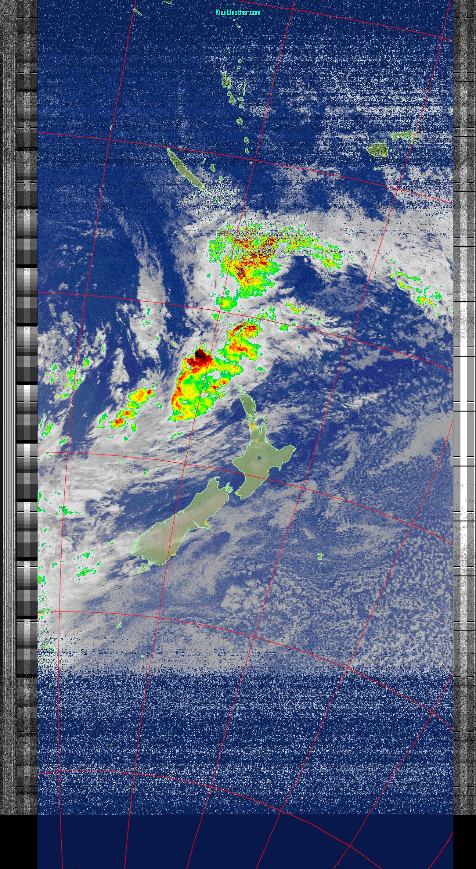
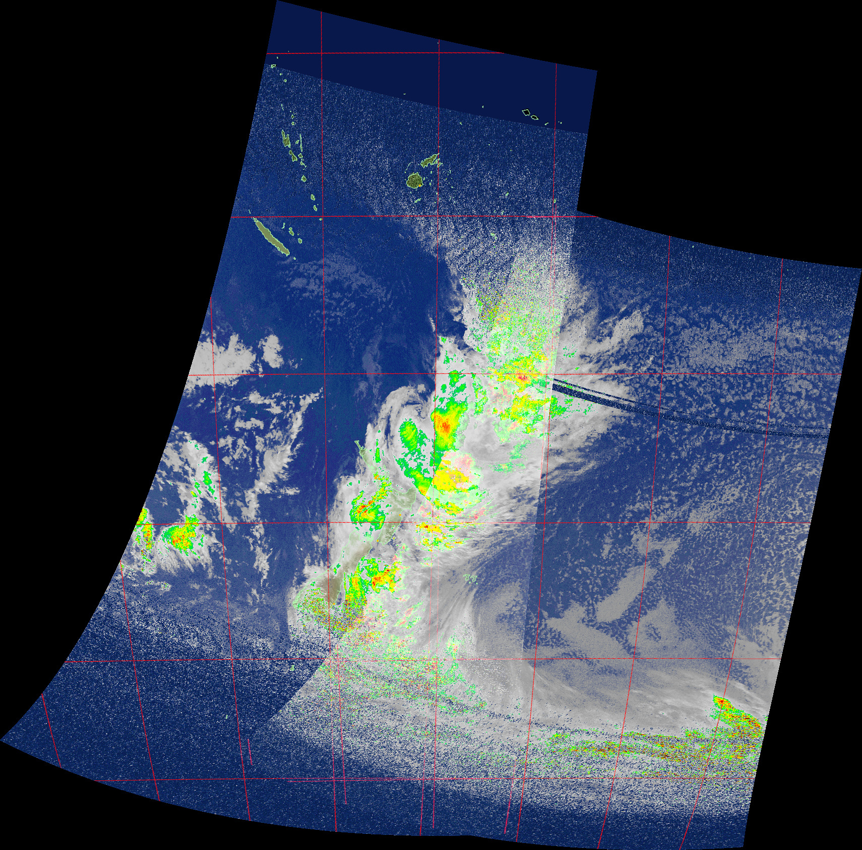
So it is easy to determine that Monday the 17th August 2020 was fairly cloud free whilst Wednesday the 19th August was fairly cloudy. And this can be validated by looking at the satellite images from those days which show the expected cloud cover.
Looking over a three month time period, it is possible to see variations in the temperature, especially weather that really stands out where it is significantly warmer or colder than not just the average temperature, but more than one standard deviation from the average. This graph clearly showed that the weather around the 15th July was significantly warmer than most of the three months.

Jumping to the data for the last year, the variation of temperature with the seasons is clearly seen with the lower temperatures around July of 2019 and most of 2020 which contrast with the highs around January – February 2020.
The unusually warm days in July 2020 really stand out in this data set as being significantly warmer than you would expect from the normal inter seasonal changes which results in questions around was the weather really that much warmer or was there an issue with the sensor during that time period? With access to a range of different sensors from nearby areas it would be possible to compare the values to help determine if it really was that much warmer or was there a likely issue with the instrumentation.

Also note that there is a small gap in the data for part of April 2020. This was a result of a code bug in the data used to read the weather sensors. But whilst there is no data for this time period, it is possible to apply statistical analysis to the data to determine what the weather is likely to have been like.
Looking through the graphs for the other sensors, it is possible to extract what the data means, especially when used in combination with the other weather sensors and the satellite images.

As an example of this, the air pressure data shows the passage of multiple different weather systems over Auckland, all of which can be seen in the different satellite images.
It is by using a combination of satellite images, weather balloon data and weather station data that the weather can be modeled to try to create predictions of what will happen over the next few days.
Watching the videos from GK-2A, especially the raw infra red one, it is easy to see the true complexity of weather systems around the world. So no wonder that the models are complex, require supercomputers to process them and the degree of accuracy drops the further into the future you are trying to look at.
No wonder weather is such a fascinating subject!